It was decided early on that Maindee needed a brand which would represent and tie together all the diverse activities in the area, and that residents, traders and visitors alike could get behind…
Branding Maindee
by Webber Design |
[This is a shortened version of the brand story. The full version will be available as a printed document in the library]
It was decided early on that Maindee needed a brand which would represent and tie together all the diverse activities in the area, and that residents, traders and visitors alike could get behind. Before we started any design work on the Maindee Identity, we developed a questionnaire for residents, traders and visitors of Maindee to tell us their feelings about various aspects of the area. There was much negativity in the responses to our survey, but there were a couple of aspects that were clearly seen as positives: Maindee’s Multicultural makeup, and it’s Community Spirit.
Here are some of the many things people said, split into negative comments, positive comments and suggestions.
Positive Comments
"Image needs to improve cosmetically”
“Clean it up, invest – its a dump”
“The triangle is unsuitable for change - focus on the car park”
“Looks tired”
“Used to be lovely, buzzing”
“Needs cleaning up to make it more village like”
“Needs environmental improvement”
“People are caring but we do have a lot of crime”
“It is not the most desirable place to live - if it improves I will stay, if not, I will move”
“Not a very safe environment”
Negative Comments
“Exciting to be part of a community lead project. Maindee is becoming more community active”
“Village idea is strong”
“Close-knit community, family-orientated”
“Diverse community and good local shops”
“Close & convenient for shops and Rodney Parade”
“There’s a lot of talent in Maindee and an interest in developing the community”
“Maindee Festival contributes greatly to the community”
“I believe it has a lot of potential”
Suggestions
“We need a community centre”
“We need something like Chapter Arts”
“Important to build on momentum of the volunteers in the library”
“Help put Maindee back on the map - local businesses pulling together - could be thriving”
“We need more youth projects and shops”
“More to be done with railway bridge. These could be magnificent gateways - giant colour murals and coherent to the high St. with colour/brand”
“Market would be lovely”
“The Library should become a social hub”
Having processed all responses to the survey, we focussed on the positive comments that were made about the people of Maindee, being its most positive asset – with high praise for the volunteers behind the library, the festival and Community House. Without the dedicated volunteers of Maindee, there is no Maindee brand identity… so we came up with the phrase:
PEOPLE ARE THE BUILDING BLOCKS OF
MAINDEE’S IDENTITY
"More to be done with railway bridge. These could be magnificent gateways - giant colour murals and coherent to the high St. with colour/brand"
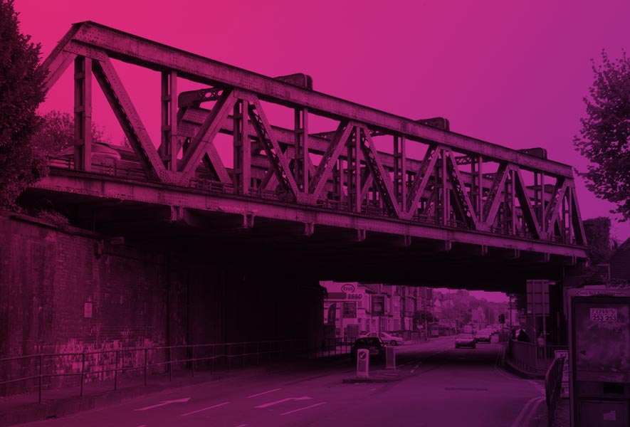
Echoing that comment above about the iconic bridge, with its interlocking iron framework, we started with the single building block, as seen on the right.
This represents YOU – a volunteer, a resident, a trader, or a visitor. It represents anyone with a passion for Maindee and a will to see it improve.
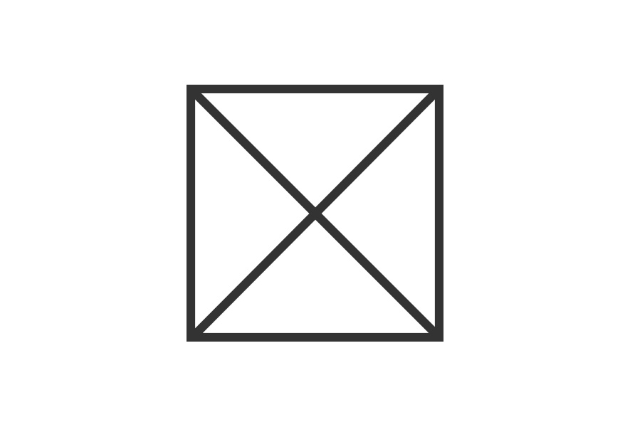
Alone it is strong, but Maindee’s true strength lies in the coming together of these individuals, working together to build a better Maindee.
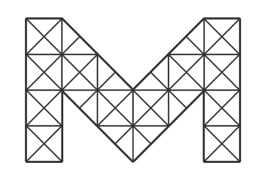
THE FRAMEWORK
We made a distinctive letter 'M' for Maindee, constructed from a combination of the individual building blocks. This is the framework for Maindee's identity, and it offers the flexibility required to represent all of Maindee's different services and projects.
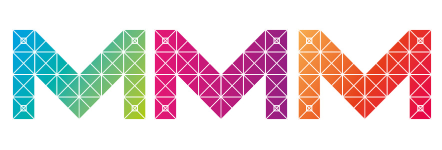
The Colours
Maindee’s multicultural diversity means that Maindee is a vibrant riot of colour – as anyone who’s ever attended Maindee Festival will know.
We’ve chosen three colourways for the identity, which we call Neon, Aqua and Flame, each is made up of a blend of colours.
The Message
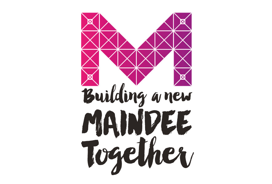
An 'M' alone wasn't enough, so we needed strapline to support the brand, and chose "Building a new Maindee Together", which echoes the construction theme, whilst also stressing the fact that these projects only happen when the people of Maindee come together to make a difference.
We wanted the typeface to reflect the 'hands-on' approach of Maindee's volunteers, whilst also offering a contrast to the rigid grid and sharp lines of the M. After much type testing we came up with the finished brand for Maindee: